| the beauty of food
MIGROS SELECTION PREMIUM RANGE
Switzerland
Packaging | Art Direction | Typography | Standards
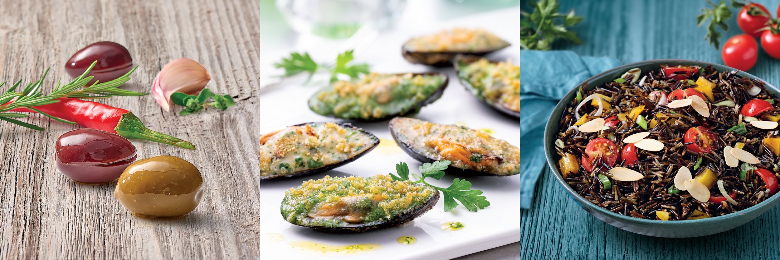
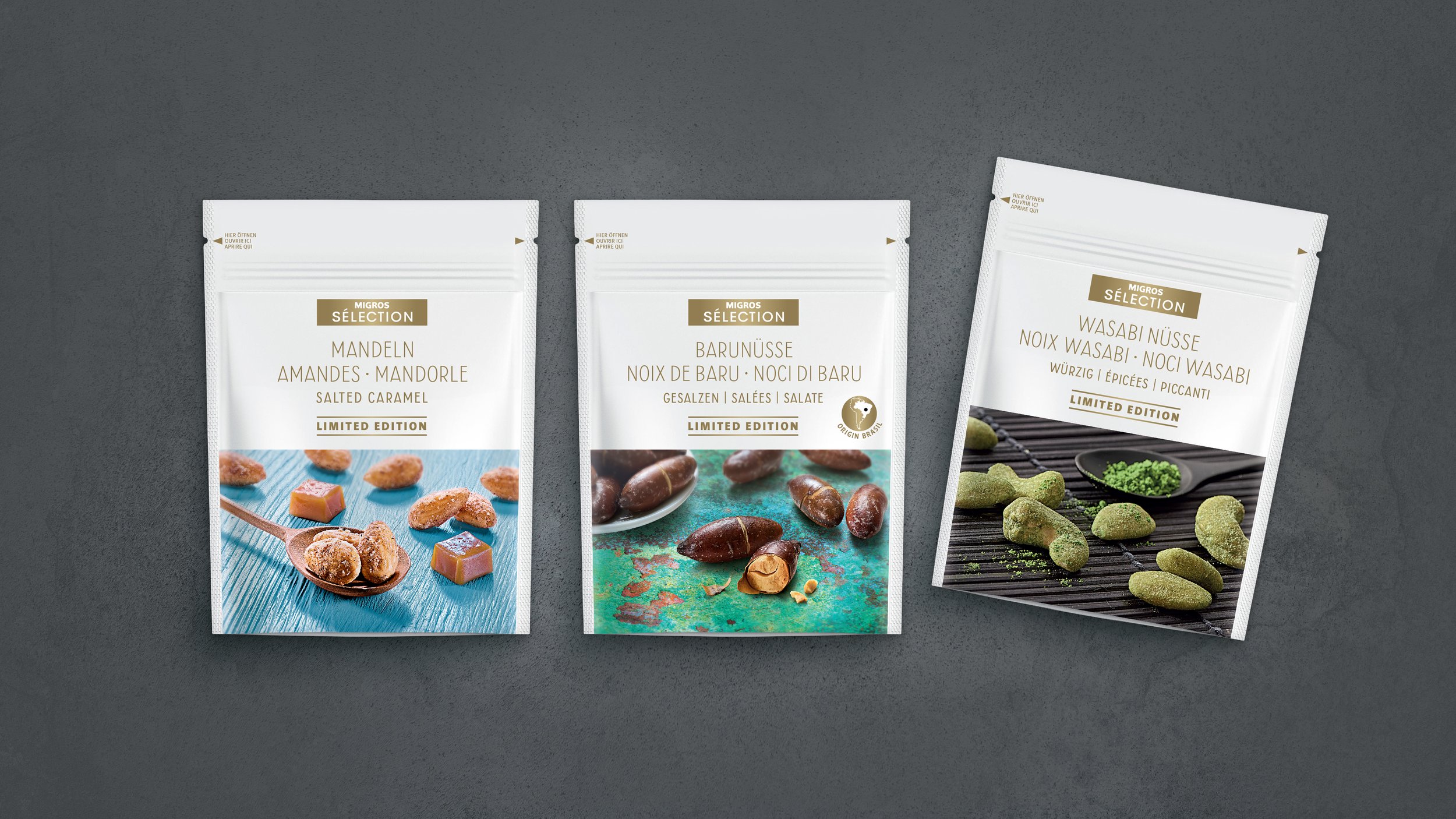
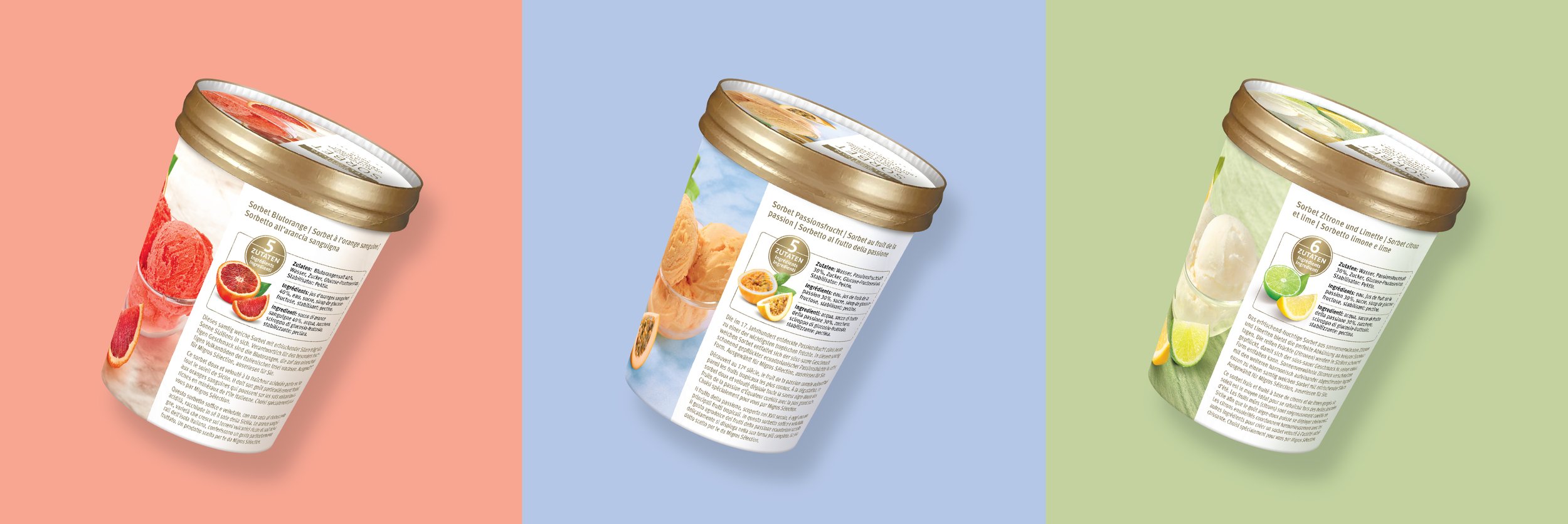
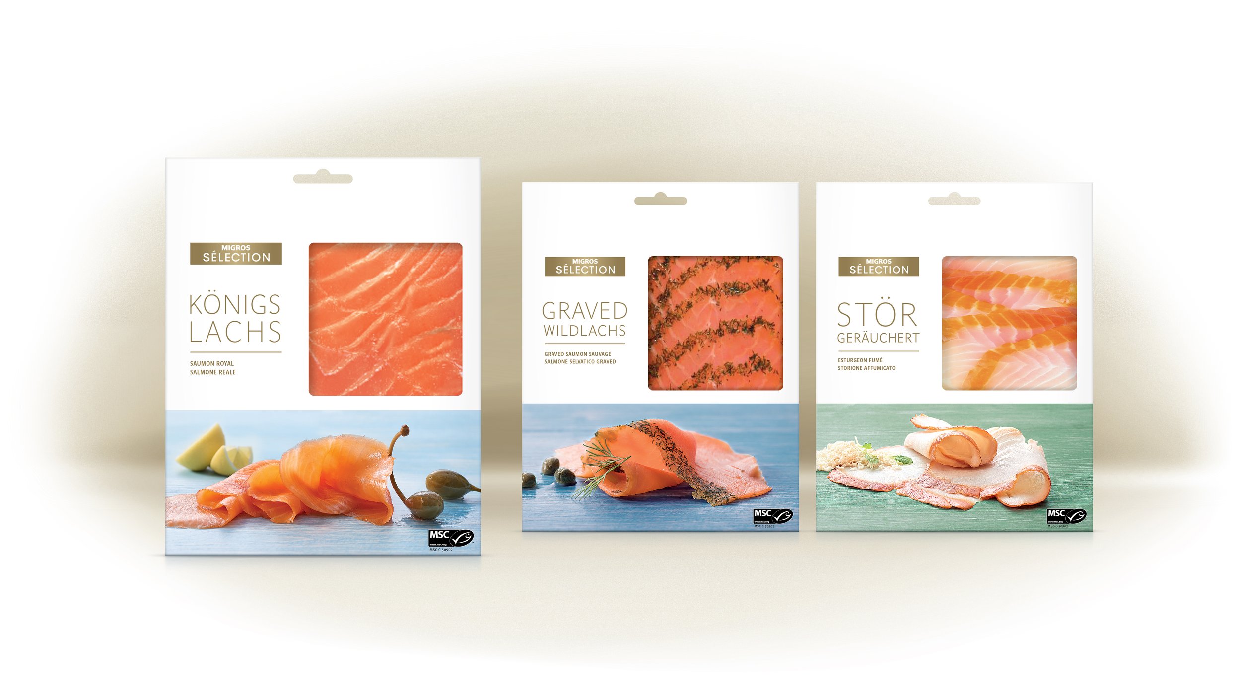
Migros breathed new life into its premium Sélection range in two transformative phases, in 2017 and 2020. The pearl white and gold signature aesthetic, along with its uncomplicated packaging structure, remained. Typography underwent a meticulous reevaluation, restoring the brand’s innate elegance. Elevated food styling bathed in natural light and intensified colours further accentuated the brand's appeal, celebrating the inherent beauty of food.

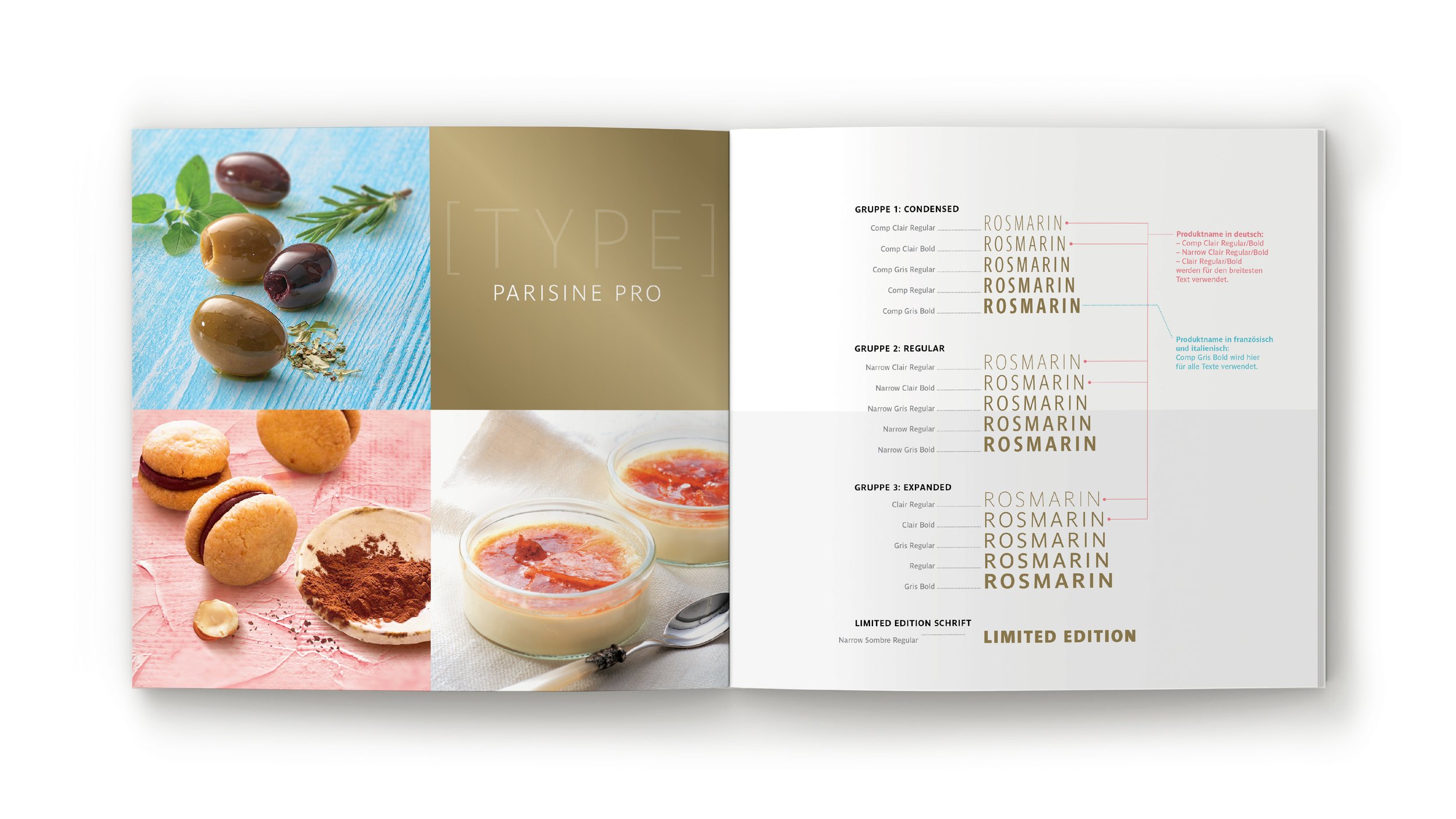
In 2017, a justified text block approach was embraced, instilling personality into clean, sans-serif typography. Prioritising a single language introduced rhythm and visual intrigue. Harmony across various text sizes was accomplished by employing a typeface with an array of weights and widths: Parisine Pro.

In 2020 new packaging regulations mandated that all three languages appear at the same size. Consequently, a more open text configuration was adopted. The Aiglon typeface was chosen for its heritage-inspired elegance, infused with just the right amount of character.